
Selecting light color is one of the most important decisions when setting up lighting for an art studio. Color temperature is generally the best way to describe light color, but with various options ranging from 2700K to 6500K, and warm-white to cool-white, you may be wondering how to decide.
In this article, we'll go over everything you need to know about color temperature and how to make a confident choice for your art studio.
A Quick Review: What is Color Temperature?
Color temperature is a way to describe the color of a white light source, and is measured in degrees Kelvin (K). A lower value indicates a more yellow light source, while a higher value indicates a bluer light source.
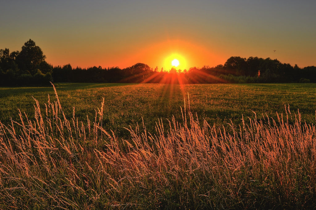
In residential settings, the warm, relaxing glow reminiscent of an incandescent bulb is commonly desired. These lamps have a color temperature between 2700K and 3000K. Low-angle sunlight, or natural light during "golden hour," can also have low color temperatures down to 3000K or so, depending on sky conditions.
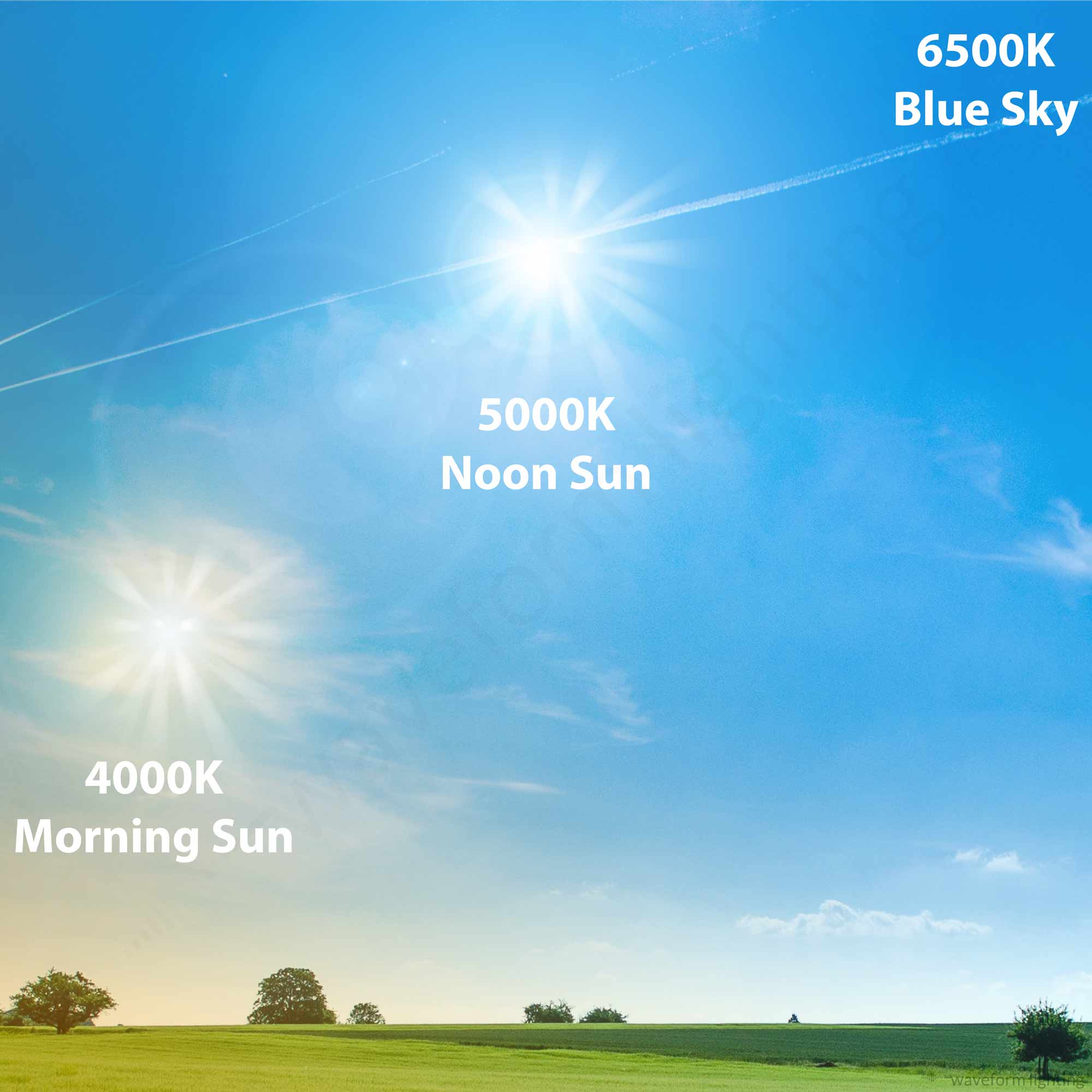
As we increase the color temperature to 4000K or so, we start to see less of yellow or orange hues in the light color. Commercial and retail lighting environments commonly use 4000K. In terms of natural light, you might see 4000K light during the early to mid-morning hours. (Check out our article on 4000K here).
Once we reach 5000K, we start to see a more neutral, white light color. In fact, from a pure color-science perspective, 5000K is where we see an equal balance between blue and yellow wavelength energy, and this is a commonly used color standard for visually intensive color industries such as textile and pigment manufacturing. Noon sunlight on a clear, summer day, typically measures 5000K in color temperature.
At 6500K, we've introduced a bit of a blue hue. This is a color temperature that matches what you would see from the blue sky on a clear day, without direct sun. Digital arts typically use 6500K as a color standard.
Why does all of this matter? Read on to learn about how color temperature can actually affect the way in which we perceive color.
Why does color temperature matter for your art studio?
In our everyday lives, we generally take for granted that light has a generally white color, and that minor variations are not important. In fact, our eyes and brains are remarkably adept at adjusting to different lighting conditions. This ability is called chromatic adaptation.
You most likely have 2700K or 3000K light bulbs in your home that you use during evening hours. As we discussed in the previous section, this is a color temperature that is quite far from being pure white - it has lots of yellow and orange wavelength energy.
Let's say you turn those light bulbs on, so that you can read your favorite book. You might think the light appears yellow (and relaxing) at first, but after a few minutes, your eyes and brain will begin to adjust to this yellow hue. You may forget altogether that you are using a light source with a yellow hue. The pages in your book will simply appear "white" and the ink will appear "black."
Around 20 pages in, you realize you have to get something from your car. You walk to your garage and turn on the daylight-white lights (perhaps 4000K) and it feels as blue as an aquarium. After a few minutes, though, that initial feeling of how blue it is in the garage fades quickly.
You now return to your couch to continue reading, and but you notice that everything appears yellow now. What's going on?!
This is your eyes and brain attempting to normalize ambient lighting conditions as truly white, even when they are not.
All of this matters for an art studio because we rely so heavily on our eyes and brain to perceive color accurately, yet our color perception can be so easily swayed by our lighting environment. In other words, we may be working under lighting with strong color hues or tints, but not realize it at all.
Depending on your studio setup, incorrect color temperature selection can cause two significant issues.
The first issue has to do with consistency. Are you painting under incandescent bulbs at night, only to continue work the next day under natural daylight? If so, your work will likely appear different depending on when you work on it. You simply cannot produce high-quality work if you can't rely on consistent lighting conditions.
The second issue has to do with color judgment and the limits of our chromatic adaptation abilities. The stronger the hue or tint is of your lighting, the more your innate chromatic adaptation needs to kick in, increasing the potential for inaccurate color perception. You are, in essence, wearing "biological sunglasses" that attempt to compensate for the color shift away from a pure, white color.
So, to sum up, the best art studio lighting color temperature is one that is both:
- always consistent, and
- is as close to pure white as possible.
Will your art studio have natural light?
As the first step in determining what color temperature lights you should install in your art studio, you'll need to know if there will be any natural light coming in through your windows.
There are, of course, architectural, interior design and other considerations when it comes to whether or not your art studio should have natural light. However, a windowless setup (or effective light-blocking blinds / curtains) is actually the most straightforward when determining color temperature selection, because natural light is inherently inconsistent due to variations on sky conditions, and we do not have to worry about matching the light bulb / fixture color to the color of the natural light from your windows.
To that end, we'll first discuss art studios without natural light. If you will have natural light in your art studio, feel free to skip to the section below.
Best Color Temperature for Windowless Art Studios
If your art studio will not have any natural light, you only have to worry about the color temperature of the lighting products themselves, so your decision will be more straightforward than if you did have natural light to account for.
For windowless art studios, 5000K is almost always the default recommendation we provide for our customers. It is also our most popular by a wide margin. This is due to several reasons:
- 5000K is the most balanced color spectrum and as a result, it is arguable to purest white color point. It has approximately equal amounts of short wavelength (violets, blues and cyans) energy as well as long wavelength (yellows, oranges and reds) energy.
- 5000K (technically D50) matches the ISO standard for "color viewing," so if your artwork were to be viewed by others in the industry, there is a good chance they will be using similar, if not the same, lighting conditions.
In limited circumstances, you may consider other color temperatures for an art studio. On the warmer side, 4000K offers a light color that may provide a more comfortable lighting environment for those who find 5000K to be too stark or harsh. If the art studio area is integrated with a residential space, for example, the closer match to the residential lighting (typically 2700K or 3000K) may be preferred.
We do not offer any lights or lamps at 4000K under the NorthLux™ brand, but they are available under the CENTRIC DAYLIGHT™ brand. Generally, however, we only recommend 4000K for art studios in limited circumstances, as it does have a relatively strong yellow hue which can make accurate color perception a bit more challenging.
On the cooler side, 6500K introduces a bit of a blue hue, similar to what you would see from a north-facing window. For windowless studios, however, north-facing natural light would not be a factor, so there is no need to "match" this color temperature using 6500K. Instead, the only reasons we see would be to match other devices or processes in the art studio that utilize 6500K (or D65) as a color standard. One example would be any digital art; computer monitors and cameras will often utilize the 6500K / D65 color point for calibration.
What color temperature is best for an art studio that has windows?
In the prior section, we discussed color temperature selection for an art studio without any natural light. As we've mentioned, art studios without natural light have the advantage of allowing for better consistency in lighting conditions.
The reality, however, is that many art studios will have some level of natural light, whether due to architectural reasons or simply personal preference. For such installations, we discuss how to choose light color temperature that best integrates with the natural light in an art studio.
Which way do your windows face?
The primary factor that determines the color temperature of the natural light coming into your art studio is the direction that the windows face.
An east-facing window, for example, will let in direct sunlight during the morning hours, introducing natural light that is perhaps around 4000K or so. By mid-day, however, the sun will no longer be shining into the window, and the light color will be closer to 6500K or even higher.
A west-facing window will be in reverse, with a higher color temperature during the morning hours (6500K), followed by a lowering color temperatures as the day progresses and the window lets in low-angle sunlight into the art studio.
A south-facing window will let in sunlight throughout the day, so it will have a bit more consistency compared to a west or east-facing window. Depending on the time of year, however, you will have a slightly different light color coming in due to the lower sun angle during winter (4000K), and higher sun angle during summer months (6500K).
North-facing windows will avoid allowing direct sunlight in at all times of the day, throughout the year. This allows for the best consistency in natural light, generally at or around 6500K throughout the day and year.
(For those living in the southern hemisphere, the analysis above for north and south-facing windows should be reversed).
In summary, east and west facing windows have the most variability throughout the day. South-facing windows are relatively constant throughout the day, but can vary across seasons. North-facing windows remain constant through the day and year.

Putting together a recommendation
After you've determined the direction that your windows face, you should now have a rough idea of what color temperature to expect throughout the day.
For art studios with north-facing windows, we almost always recommend using 6500K lighting to match the consistent, blue-sky hue you will have coming through your windows.
Art studios with south-facing windows will likely benefit from 5000K color temperature lights, as you will have the sun come in during most of the day, especially during the morning and late-afternoon hours.
East and west-facing windows can be a bit trickier, and our recommendation here would be dependent on what hours of the day you plan on using the art studio.
An east-facing window, for example, will have lots of morning sunshine, lowering the color temperature of your art studio. By afternoon, however, the sun will be shining on the other side, and the window will be letting in light close to 6500K, the same as what you would get from a north-facing window.
Therefore, if you have an east-facing window and only plan on using the art studio in the afternoon, we would recommend 6500K without hesitation. Conversely, if you have a west-facing window and only plan on using the art studio in the mornings, we would likewise recommend 6500K.
If neither of these apply, and you intend to use the art studio through the day or without a predictable schedule, we would recommend 5000K as a "compromise solution" that accounts for both warmer, direct-sun color temperatures as well as cooler, blue-sky color temperatures.
Other factors to consider
Our prior discussion focused on the quality of light that we get from our windows. You will also, however, want to consider the quantity of light you get from your windows.
By quantity, we generally want to know how much light is coming in through the window and falls onto your work area / surface. Factors that would affect this include:
- Window quantity and size
- Distance from the window to the work area
- How exposed the window exterior is to the sun / sky
Some art studios will have tiny windows in just one corner, while others may have very large windows that stretch from the floor all the way to the ceiling. This is an important distinction, as the amount of natural light that comes into the art studio will affect how important it is for the artificial lighting to match the natural light. If there is only a small amount of natural light coming in, it might not matter much when it comes to selecting the color temperature of your lighting.
Don't Forget about CRI (Color Rendering Index)
While this article discusses color temperature selection, color rendering, measured using the color rendering index (CRI) is also an important factor when choosing among lighting products.
CRI is easy to confuse with color temperature as they both pertain to light color, but the two are not directly related.
Even if you've selected the correct color temperature for your art studio, your color perception can be inaccurate if your lighting does not have a high enough CRI value. In short, we recommend lights with a CRI value of 95 or higher, and an R9 value of 80 or higher.
Bottom Line
We covered a wide range of factors and sub-topics relating to art studio color temperatures. Fundamentally, however, our general recommendation is to use 5000K lights for your art studio, unless you have windows that let in indirect skylight, in which case we recommend 6500K to match this light color.
Don't forget, that under all of this technical and scientific discussion, lies the importance of how you feel as an artist, as well as your personal comfort in the space. In fact, we know how important it is that the light feels right, and we actively encourage our customers to try out both the 5000K and 6500K to experience it first hand by taking advantage of our 30-day free return policy.
Art studio color temperatures can be a bit tricky to determine and may require some testing and patience to figure out. Once you're satisfied, however, you'll rest confident knowing that you've done everything you can to optimizing your lighting environment to ensure you can produce the best quality artwork possible.